Measuring how much of the sky is visible
I pretty much spent the entirety of my pre-adult life in New York City. While on occasion the family would go on trips outside, I was 100% a city kid and grew up taking the busses and trains to school and essentially hanging out within the confines of the five boroughs. So when I went to college outside of the city, I very distinctly remember two observations I had about the sky. First, the sun felt stronger, probably because the air was less polluted. But most importantly, I felt the sky to be "too big". In fact, even now when I visit Long Island, I feel that the land on the south side, flattened by glacial melt, is disturbingly flat and the sky is too big. Let's not get into if I visit some extremely flat farmland area where I can see the horizon all around, that is downright unsettling to me.
I knew pretty much that the cause of the uneasiness I felt was simply because I grew up used to the caverns of Manhattan and the tree-lined streets of Brooklyn and Queens. "The sky" usually mean this little slice of weather peaking out between all the buildings and trees. You don't give it much thought as you go about your daily life, but eventually you get used to how things are. Meanwhile, people who come from places where the sky is much more open will feel claustrophobic in the densest streets.
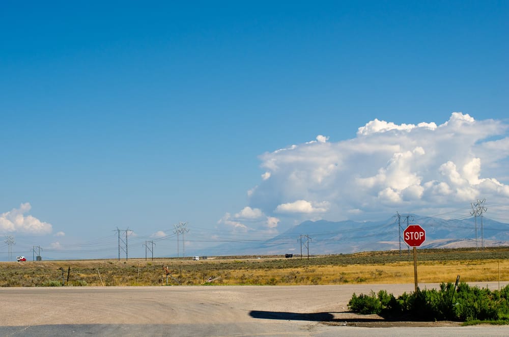
So, the past week while driving to an errand and noticing some giant thunderstorms in the distance, I was reminded of the sky again and wondered to what extent that the amount of sky I could see differed. Surely, someone must have studied this before, right?
Sky View Factor
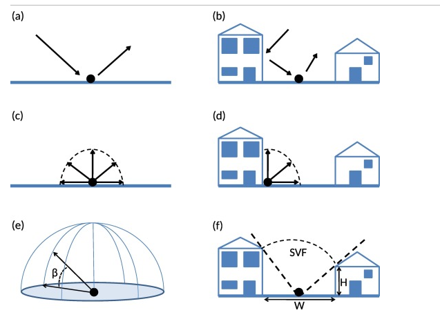
Of course someone has, in fact many people have. There's a metric called "Sky View Factor" that is essentially "what percent of the celestial hemisphere is visible from a given location".
For example, there's this paper, "Sky view factor calculations and its application in urban heat island studies" by Dirksen, Ronda, Theeuwes, and Pagani that show various uses and calculations for SVF. The concept is used to not only study what could be seen from the ground, but the converse, what from space can reach the ground. This has implications for studying things like climate research, urban heat islands, solar output, and other details.
The calculation for SVF can be done a number of ways. Probably the most direct and accurate way is to use GIS systems and use available LiDAR measurements of a location to get exact height measurements of surroundings. Various locations and government agencies sometimes publish Digital Surface Models (DSM) of locations for use by the public and researchers. For example, New York State provides a bunch of such GIS data. If such data is available, then it probably yields the most accurate results. That said, GIS software has a steep learning curve and I completely failed at trying to use that data for my local neighborhood this week.
A less accurate, but still decently good method is to leverage mapping services like Google Street View. Since that is a giant archive of panorama photo data of locations around the world, you can get a good estimate of the SVF by essentially downloading a panorama of a location, stitch the images together, then use a classification model to figure out how many pixels of the sky are actually sky versus some kind of obstruction. Obviously this very long data pipeline depends on a lot of systems (sky detection, horizon detection, etc) that contribute error, but in exchange you can get an estimation at any point where the streetview car has ever passed. That is most certainly better coverage than official DSM data will cover, especially for remote areas.
Finally, if you have access to a camera, you can do a very similar analysis by taking panoramas or fisheye camera shots yourself and doing similar calculations with those pictures and not having to rely on a vendor.
A few data caveats: obviously things are never simple. The biggest issue is tree foliage, which depends on the exact season the streetview images were taken assuming trees are in the area. So if you wanted an even more accurate value you must account for seasonal and botanical differences in the data. That's beyond my scope since I'm not doing serious research with my data. The sampling range of 1km and 30 points was also completely arbitrary and likely doesn't make sense for complicated urban areas or parks with few drive-able roads. But to do better you'd have to come up with more advanced sampling methods.
A hacky SVF tool
So to answer my own question of figuring out what sort of SVF value I grew up in, compared to the SVF values of other places, I slapped together a small tool to pull data from the Google Maps API and do the calculations. There are some academic tools that does very similar stuff but many are either outdated, or use a big pytorch/CUDA model for sky detection, or is otherwise clunky to use. So I got the LLMs to slap together a simple thing.
So for anyone who wants to mess with it, here's the code.
 randyau
Here's roughly how my script works:
- I give it a list of locations, basically lat/lon points with names
- The software draws a 1km circle around that point and randomly pulls a sample of 30 points in that circle.
- For each of the 30 sample points, it pulls street view images, stiches a panorama, runs a local sky detection model, and calculates an aggregated SVF value (mean and median) for that location
- Because Google Maps API downloads cost money (after a free usage tier), and you don't want to hammer OpenStreetMaps or similar, the script does a lot of aggressive caching and rate limiting
- The output is shown in a local html file with locally downloaded OSM tiles. There's a raw CSV dump that gives the individual SVF values for all the locations so you can dive closer into the data.
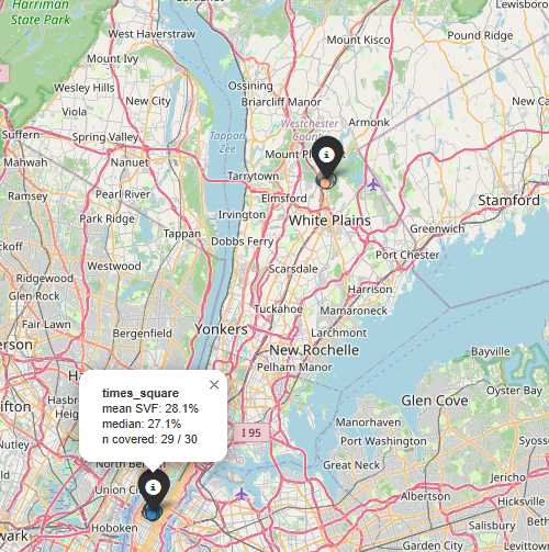
Here's the list of data points I wound up calculating:
- Times Square, Manhattan, NY: median SVF: 27.1%
- Bay Ridge, Brooklyn, NY: 57.5%
- Kensico Dam, Westchester, NY: 50.0% (a park area north of NYC but some samples wandered into a nearby neighborhood and highway underpass)
- Stony Brook University, Long Island, NY: 70.5%
- Montauk Point, Long Island, NY: 91.1% (the furthest tip of long island, essentially just ocean and a lighthouse)
- Boston Commons, Boston, MA: 30.4% (most points land on the streets around the park itself)
- Beacon Hill, Seattle, WA: 80.8% (I just remembered the name of the area from visiting the big Boeing airfield)
- Mission District, San Francisco, CA: 60.5%
So apparently, in my mind, places that are 25-60% SVF is about "normal" to me. If anything I'm surprised that the measurement of Brooklyn wound up being 57%. Looking closely at the data, a bunch of the residential side streets have SVFs ranging from 20-40%, but a bunch of locations along a wide main street consistently had 85% SVF. Regardless, if we assume I'm used to about 40% SVF, the fact that my university having 70% SVF pretty easily explains why I thought the sky felt too big.
I think it could be quite fun calculate SVF values for various locations just to see how things are in various places around the world. The only problem is that the Map API calls aren't super cheap, with 30 samples per location, and 9 photos to download to stitch together and do the calculation, each location costs close to $2 to pull. You can of course lower the number of samples and tweak other things to stretch your budget.
If anyone does make use of this for something, please let me know.
Standing offer: If you created something and would like me to review or share it w/ the data community — just email me by replying to the newsletter emails.
Guest posts: If you’re interested in writing something, a data-related post to either show off work, share an experience, or want help coming up with a topic, please contact me. You don’t need any special credentials or credibility to do so.
"Data People Writing Stuff" webring: Welcomes anyone with a personal site/blog/newsletter/book/etc that is relevant to the data community.
Counting Stuff Official Forums: Discuss posts, or other data topics with the community.
About this newsletter
I’m Randy Au, Quantitative UX researcher, former data analyst, and general-purpose data and tech nerd. Counting Stuff is a weekly newsletter about the less-than-sexy aspects of data science, UX research and tech. With some excursions into other fun topics.
All photos/drawings used are taken/created by Randy unless otherwise credited.
Supporting the newsletter
All Tuesday posts to Counting Stuff are always free. The newsletter is self hosted. Support from subscribers is what makes everything possible. If you love the content, consider doing any of the following ways to support the newsletter:
- Consider a paid subscription – the self-hosted server/email infra is 100% funded via subscriptions, get access to the subscriber's area in the top nav of the site too
- Send a one time tip (feel free to change the amount)
- Join the Approaching Significance Discord — where data folk hang out and can talk a bit about data, and a bit about everything else. Randy moderates the discord. We keep a chill vibe.
- Get merch! If shirts and stickers are more your style — There’s a survivorship bias shirt!