
Why You Are (Probably) Measuring Time Wrong: Why do we need to use Survival Analysis more
Author: Michał Chorowski
[Hey everyone! A guest post from Michał this week! This newsletter is always willing to host/share data-related content, so if you've created anything you'd like to share, reach out. ~Randy]
If you liked this post or have any questions, feel free to reach out to me on: Linkedin: https://www.linkedin.com/in/michal-chorowski/
The post was written based on a presentation delivered at Quant UX Con, November 6th, 2025. You can still register and watch the recordings here: https://www.quantuxcon.org/quant-ux-con/quant-ux-con-2025
All of the data is artificially simulated for illustrative purposes and is not real user data due to privacy reasons.
For the purpose of some calculations, we assumed the date of analysis is November 6th 2025 (the date when this presentation was given).
Time is perhaps one of the most fundamental metric we track in UX research. Whether we call it conversion time, time to onboard, task completion time, velocity etc., anything that involves measuring the duration between a starting point and an ending point is a time metric. Time metrics are crucial for understanding user behavior, discovering UX issues or measuring productivity.
But what if I told you that most of the intuitive methods we use to measure time are fundamentally flawed, leading to systematically optimistic and misleading results?
This is something that has occurred to me at my work when I was tasked with measuring time-to-onboard for various cohorts of customers. And once I understood the issue with the “simple” approach that was recommended to me by stakeholders and colleagues, I have been noticing the same biases everywhere, both at work and in everyday news.
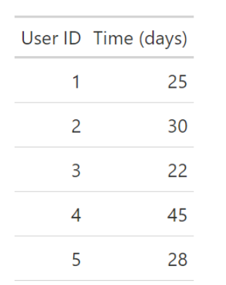
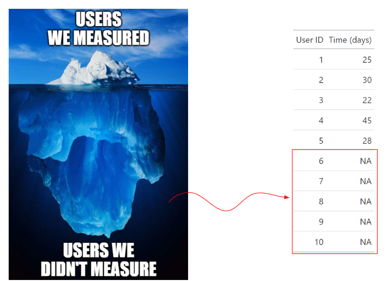
The common approach is simple: pull a recent batch of data, find the few users who completed the task, and calculate the mean or median time. For example, if 5 users finished a task, the average might be calculated: Mean(25, 30, 22, 45, 28) = 30 days. This approach, however, hides two massive pitfalls that, once recognized, seem to appear everywhere.
The Two Critical Sources of Error
The intuitive (and often wrong) way of measuring time suffers primarily from two types of bias:
1. Survivorship Bias (A Type of Selection Bias)
What It Is: Survivorship bias is a critical error where a study only includes the "survivors" of a process. In our quantitative UX context, this means only including users who successfully experienced the event, such as completing a task or converting.
The Problem: This method ignores subjects who failed, churned, or simply didn't convert before the measurement was taken. The result is a massive bias that leads to overly optimistic conclusions about how fast or successful a process is.
Real-World Examples:
- “We weren’t measuring the right thing”: Jeff Bezos once recounted that Amazon's metrics showed customer support waiting time was less than 1 minute, yet anecdotes suggested much longer delays. When he dialed in, the wait exceeded 10 minutes.
A likely cause? If the wait is too long, customers hang up, meaning they are never included in the "time waited" metric—only the 'survivors' who stayed on the line long enough to be served are measured.
Source: You can see the interview here. - "Deutsche Bahn apparently cancels trains to improve statistics": An investigation by Der Spiegel showed that Deutsche Bahn was deliberately cancelling delayed trains in order to improve their punctuality statistics. The cancelled trains sometimes continued to run empty while passengers had to wait for the next connection.
Why were the trains cancelled? That's because cancelled trains were not included in the official metric.
Sources: Article 1, Article 2 - Engineering Velocity: An engineering team I worked with reported a significant improvement in the N-th percentile days needed to launch a feature (calculated as the N-th percentile of number of days = date ticket closed - date ticket logged).
The question is: did they actually launch faster, or did they simply decide to ignore or silently "cancel" the most complicated and time-consuming features, thus only measuring the fast, easy ones? 1
Understanding the source of Survivorship bias
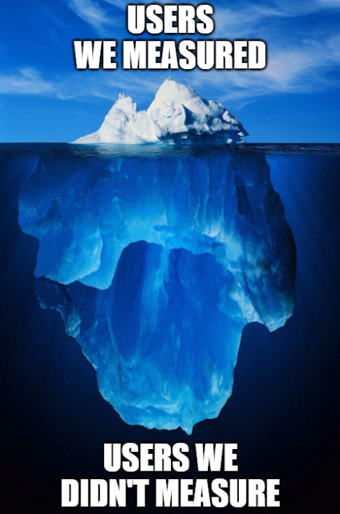
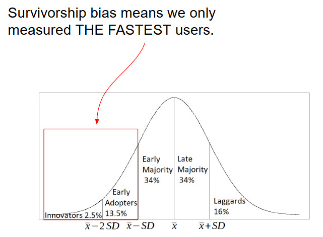
To understand the source of the survivorship bias in our time metric calculations, we can recall the Innovation Diffusion model by Everett Rogers2 illustrated in the image below. If we split our population (it can be users, objects, features, trains, etc.) based on the time they need to complete the task, we see that discarding users that haven't completed the task in the naïve approach means we only measured a selected group of the fastest users. This will create a significant, optimistic bias.
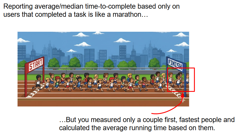
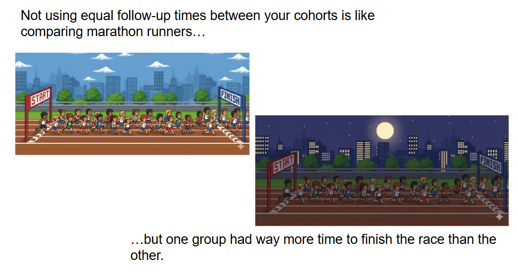
This can be also seen clearly in the marathon analogy below. The typical approach measures only the fastest runners and forgets about everyone else who hasn't completed the race yet.
1 When I included the features that haven't been launched yet, assuming their date ticket closed would be today (so current date of the analysis) the N-th percentile metric actually showed a large decrease in engineering velocity.
2Rogers, Everett (16 August 2003). Diffusion of Innovations, 5th Edition. Simon and Schuster. ISBN 978-0-7432-5823-4.
2. Differential Follow-up Bias (A Type of Measurement Bias)
What It Is: This systematic error occurs when the risk of an event (like task completion) is compared between two or more groups that have been observed for different total amounts of time.
The Problem: The time-to-event metrics (including mean and median) are highly dependent on the time window chosen for the analysis.
Example: A Product Manager told me that based on their conversations with clients, "customers take on average 6 months to onboard". The PM asked me to verify this and find the actual time that it takes to onboard based on a larger sample. Here is some data that I pulled:
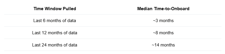
What's going on? Why is the median increasing? It's simple: shorter windows systematically exclude customers who need more time. As you use longer windows, you include more of the slower customer segment, causing the median to continually rise.
Here is my conclusion: The statement "customers take on average 6 months to onboard" is meaningless, unless the time-frame for measurement is also specified. You need to tell me for how long you measured it.
Here is another example
Consider we measure the average time-to-convert (of customers that completed the task) in monthly cohorts. We launched a new feature in July and want to measure whether it decreased the conversion time.
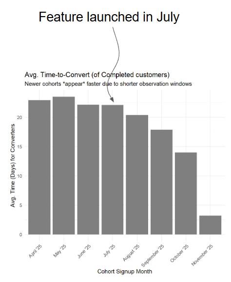
Based on the image above did the feature decrease the time-to-convert?
We don't know!3 We simply see that younger cohorts had less time to convert at the time of measurement (November 6th 2025).
The average time of the November cohort can’t be more than 6 days because today is 2025-11-06 so they only had 6 days to convert…
Here is another interesting example I found in a survey:4
DORA 2025 Survey question: What is your lead time for changes (that is, how long does it take to go from code committed to code successfully running in production)?
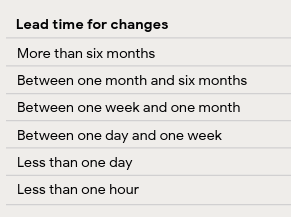
Participants had to select one of the options above. But based on what we just learned, we can conclude that a user should never select an option shorter than their tenure at the company. For example, if the respondent is a new-joiner they should never select "More than six months" because they haven’t worked 6 months to even work on a change this long!
Moreover, younger companies can be expected to have lower average "lead time for changes" because they haven't been around long enough to experience many 6+ months changes.
How can we protect ourselves against such situations? We can for example specify the time window in the question "Thinking about last year in your role [...]".
Another fix is to perform a sensitivity analysis on the "new hires" or "company age" to make sure the employee or company tenure did not skew our results.
Again, we can understand the differential follow-up bias through the lens of the innovation diffusion model
As in the image below, when different cohorts or groups are measured for different amount of time, they measured different kind of users.
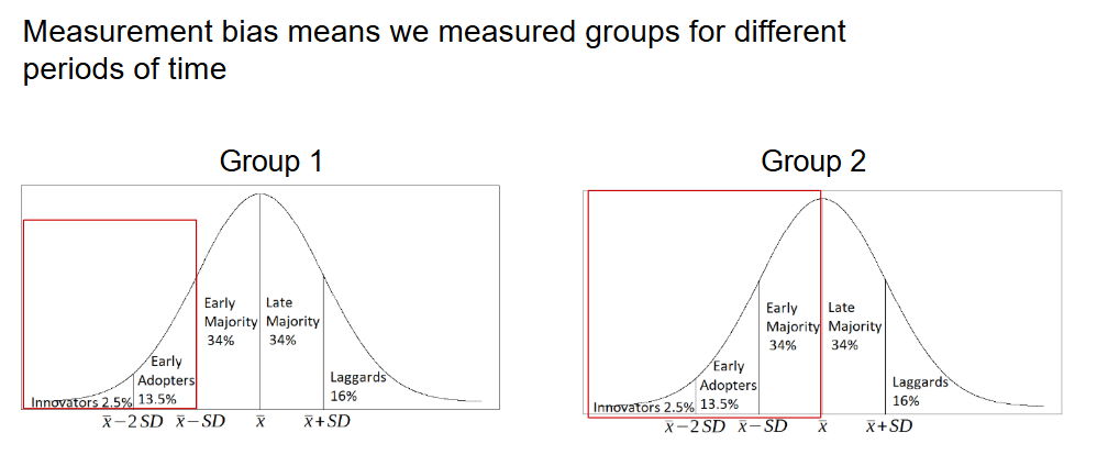
Generally, the longer you wait for your sample to complete the task, the higher the mean and median are going to be because we allow more time for “Laggards” to be included in the sample.
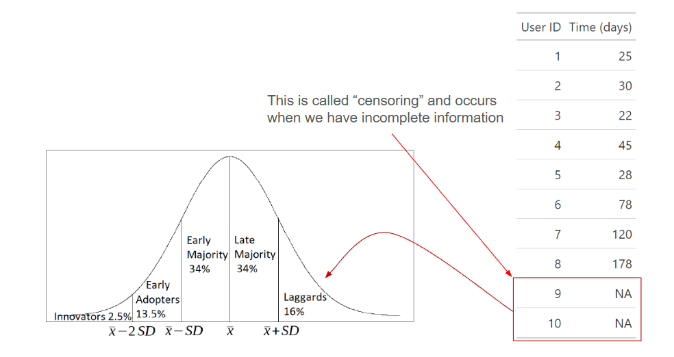
The users who haven't completed yet at the time of measurement are considered "censored".
Censoring is a term from statistics and is a condition in which the value/outcome of a measurement is only partially known. In our case, the we know the start date for each user but we don't know the end (completion) date for some users (this is called right censoring).
3In this case we know the answer is no, since I generated random numbers from the same distribution for each cohort-month. Lower average time for the November cohort is only due to the uneven time windows.
4 To be clear: I haven't read the full survey report and I don't know if this issue influences any of the insights there (probably not). My goal is not to critique the DORA survey/report but to highlight a real-life case where differential follow up bias can create challenges.
The Quantitative UX Solution: Survival Analysis
From what we've seen so far, it seems we need to wait for everyone to finish in order to get an unbiased time-to-event value.
But we don't know how long we have to wait for those Laggards or if they will even ever complete the task!
Luckily, we have Survival Analysis, which is exactly the tool designed to handle both survivorship bias and differential follow-up bias.
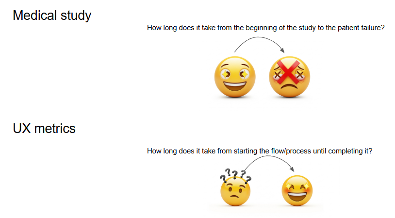
Survival Analysis has been applied in numerous fields: engineering, biology, systems reliability, medicine, etc. Just as medical studies compare whether a new drug improves patient lifetime by understanding the probability of survival over time, we can apply this to UX metrics like time-to-conversion or time-to-feature launch.
In medical studies, the "event" is typically death or failure. In UX, we usually want to decrease the time-to-event, so the "event" or "failure" becomes a good thing, In UX, "the event" can be something like:
- Completing the task
- Converting to the product
- Shipping a feature
- Reaching a given step in a conversion funnel
Key Concepts and Metrics
1. Survival Function S(t) = P(T > t):
Let T be the time to event (e.g. number of days/minutes from starting to completing a task). It is often called Time-to-Failure in medical contexts. But in UX, "Failure" is a good thing because it indicates completion of a task.
Survival functions measures the probability that a patient will survive longer than time t. In UX terms, this is the probability that a user has not yet completed the conversion/task after time t. You can also read it as probability that the event of interest happens after time t.
2. Cumulative Distribution Function F(t)
Since we are often interested in completion, we look at the opposite of the Survival Function: the probability that the event happens by time t.
F(t) = 1 - S(t) = P(T ≤ t)
3. The Kaplan-Meier Estimator:
The Kaplan-Meier Estimator
The Kaplan-Meier estimator is a non-parametric method used to estimate S(t) and F(t). It is based on calculating the conditional probability of a user not experiencing the event (converting) on a given day ti, conditional on the individual still being "at risk" (not converted yet) just before that day.
The core calculation for this specific interval probability is:
(1 − di / ni)
Where the components are:
- di: the number of events (conversions) that happened at time ti.
- ni: the number of people who survived until just before ti (those "at risk" of converting).
The probability of surviving longer than t is a product of these individual conditional probabilities (following the chain rule of probability):
Ŝ(t) = P(surviving past time t1) × P(surviving past time t2 | given you survived past t1) × P(surviving past time t3 | given you survived past t2) × ...
This gives us the full estimator equation:
Ŝ(t) = ∏ i: ti ≤ t (1 − di / ni)
Crucially, users who haven’t completed the flow (the censored individuals, often marked with a cross in visualizations) still provide valuable information because we know how much time they have spent in the funnel already. Their time spent in the funnel is included in the final estimate even if they never converted!
Unbiased Metrics Derived from Survival Analysis
Survival Analysis allows us to derive metrics that are unaffected by censoring. I will present those on a simple dataset:
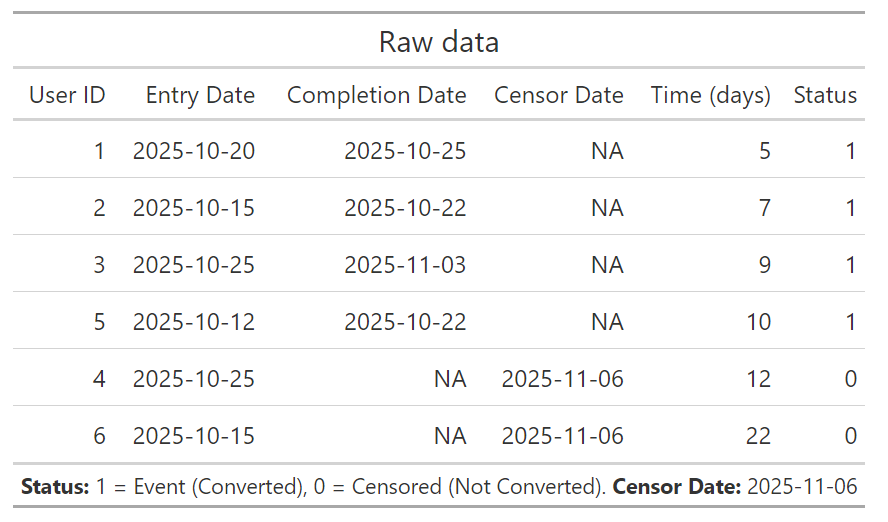
Some key metrics we can calculated using the Kaplan-Meier estimator:
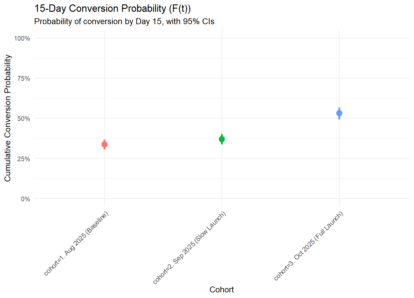
- Probability of Conversion: The chance a user converts by a specific day (e.g., probability of conversion within 10 days might be 0.667).
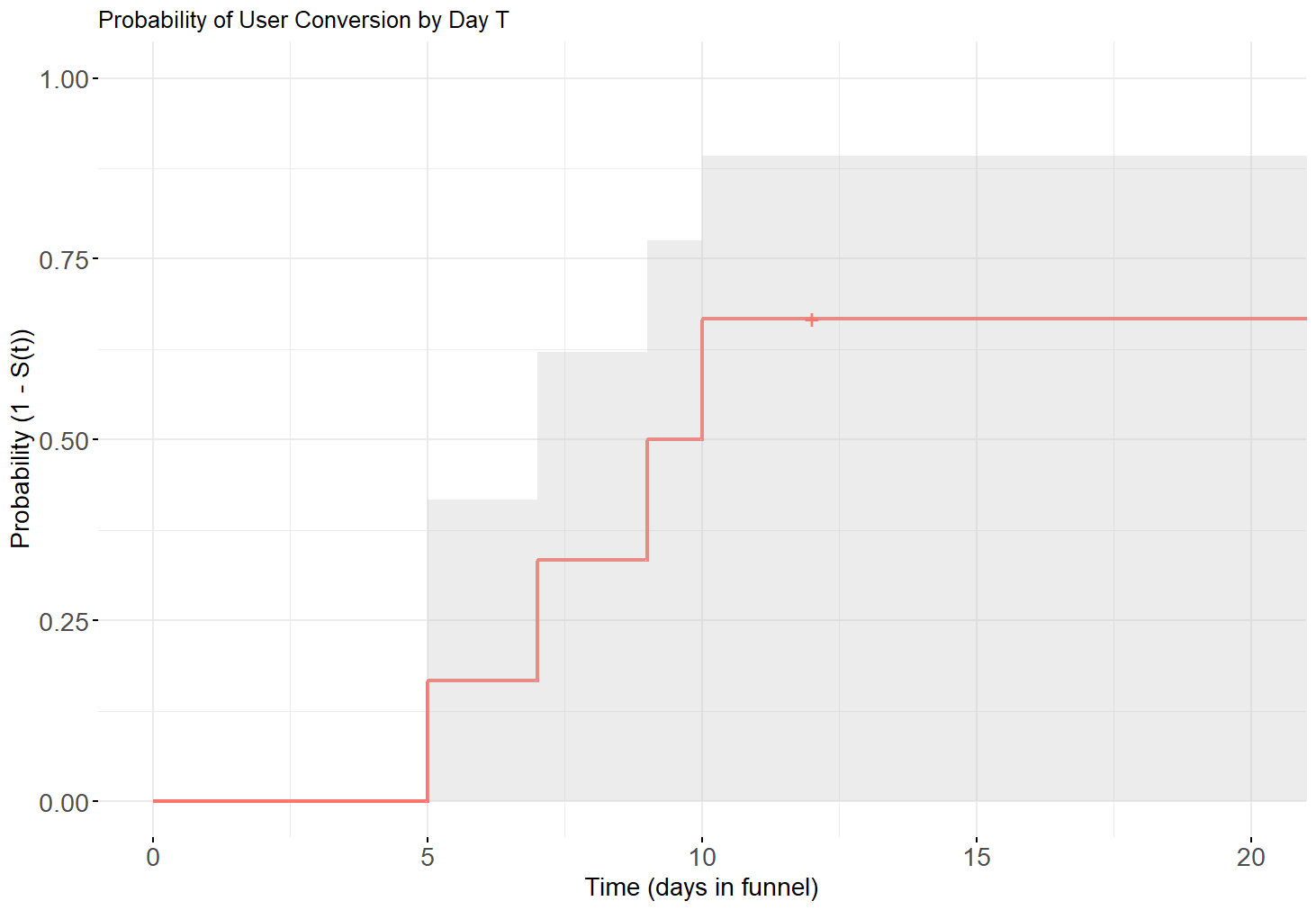
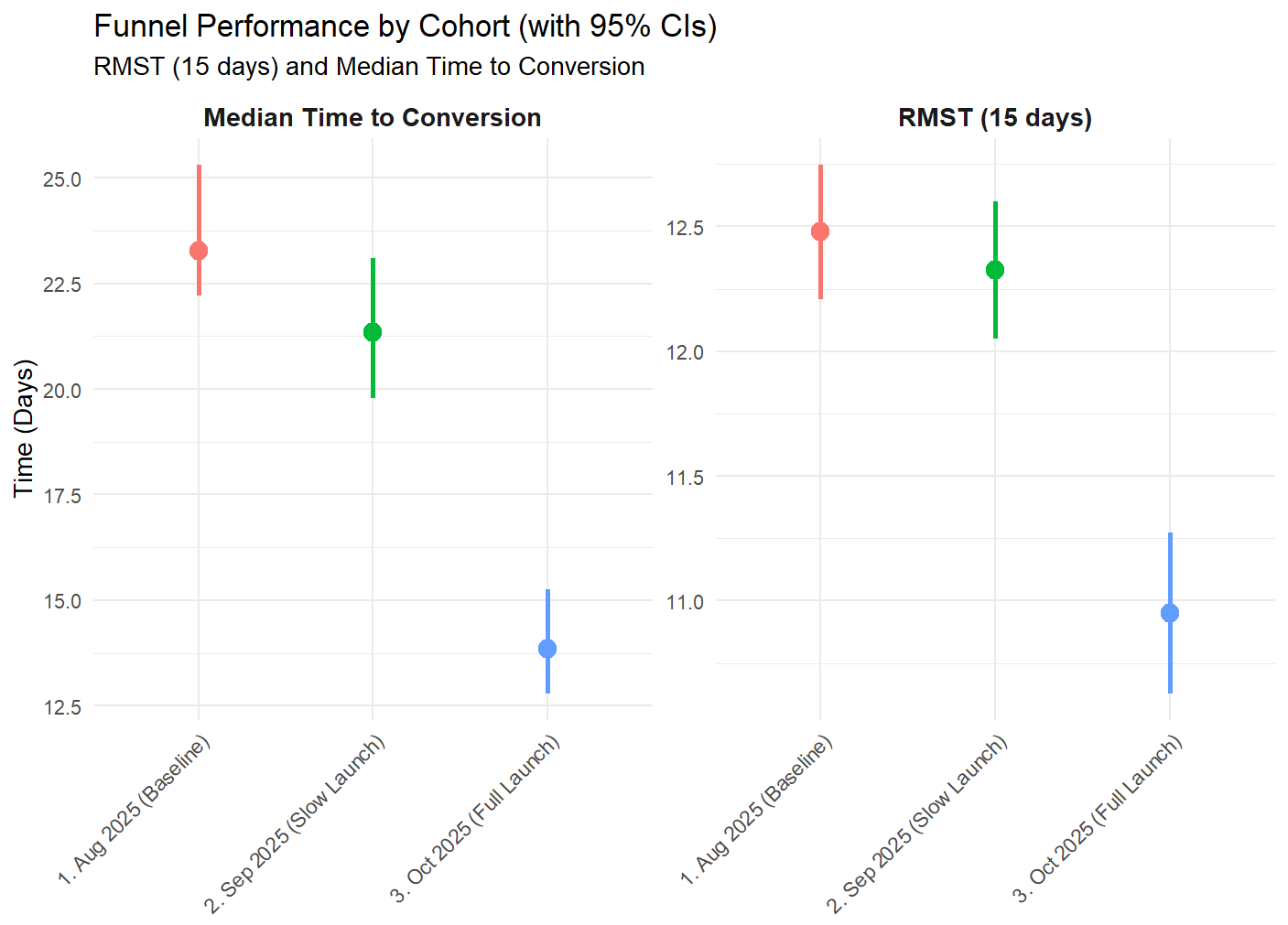
- Median Conversion Time: Defined as the time t at which S(t) reaches 0.5, i.e., the time by which we expect half of the population to convert. For example, Median conversion time might be 9.5 days.
- Average time to conversion (explained below).
Restricted Mean Survival Time (RMST): The true Mean Survival Time requires observing the sample "forever" (until every user converts).
For all of the nerds out there, this can be written as:

Since we can't wait until the heat death of the universe, we can instead calculate the RMST. The RMST is the average number of days a user spends in the funnel (without converting) during a specific, defined time window (e.g., the first 15 days). Anyone who doesn't convert or get censored by day 15 is counted as having "survived" in the funnel for all 15 days. It is defined as:
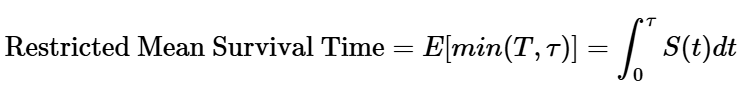
where τ is the truncation time, a fixed, pre-specified time point chosen by you to define the "restriction" window. So it's the expected value where for each user we take their time-to-event if it is known and if it is not known, we use the truncation time instead.
The RMST can also be calculated as the area under the S(t) curve (proof left as an exercise to the reader 😉).
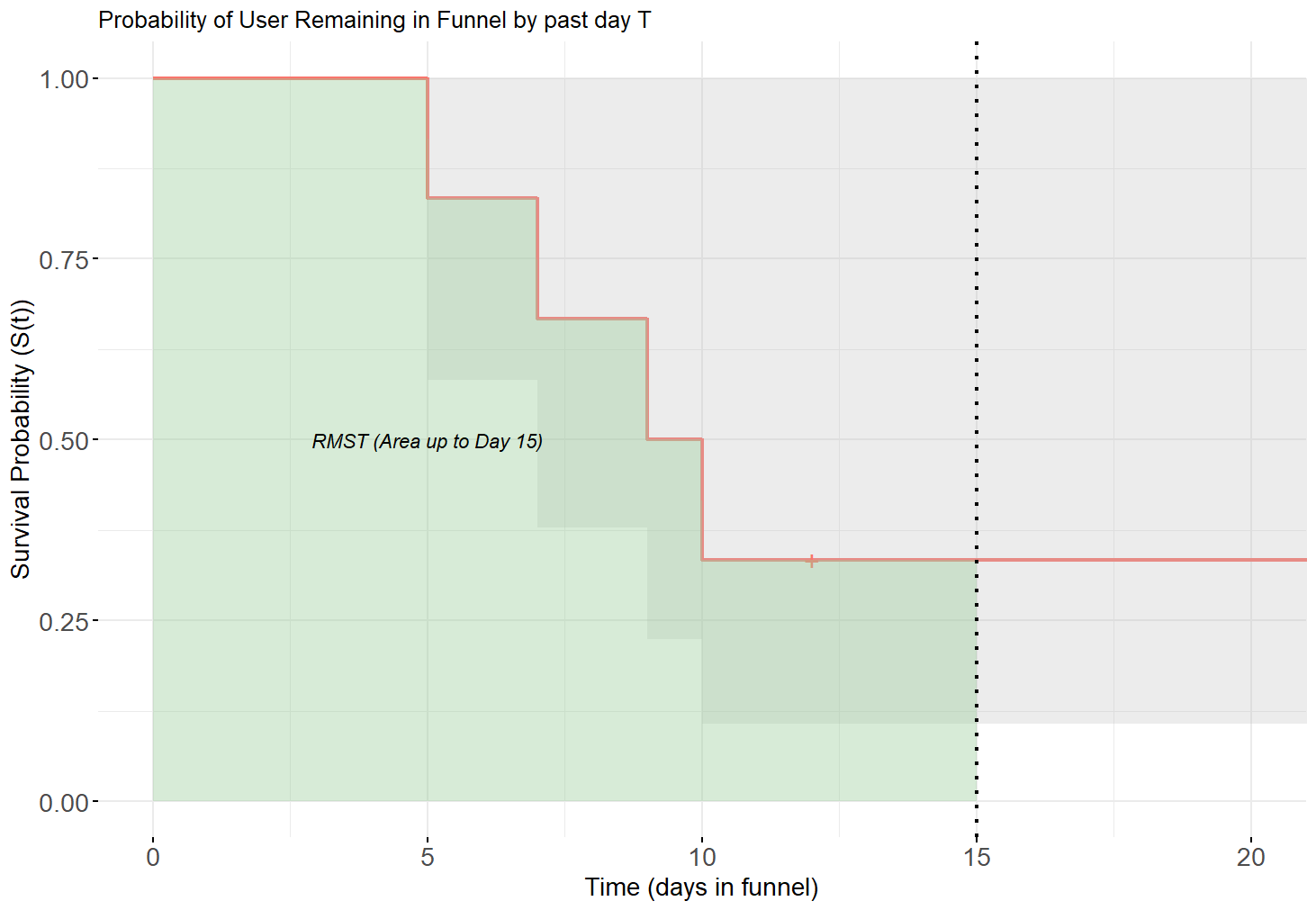
Using the toy example from our table: a naïve (biased) estimate is Mean(5, 7, 9, 10) = 7.75 days. However, the RMST for the observed time window (22 days) is 12.5 days, revealing how the naïve approach grossly underestimates the time required.
Comparing Cohorts Unbiasedly
Survival Analysis is excellent for measuring the impact of launches by grouping users into monthly or other cohorts.
- The steepness of the survival curves measures the velocity of conversions, helping us understand the time horizon where improvements are most effective.
- A curve plateau suggests that users are giving up past a certain point (e.g., no longer converting past 85 days).
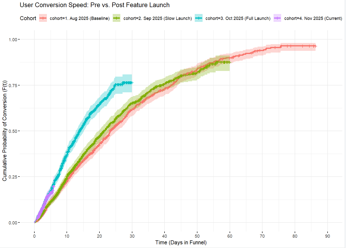
By comparing cohorts, we protect against differential follow-up bias because the curves are only drawn up to the point where data exists for that specific group. This allows us to create unbiased month-over-month comparisons by taking the curve values at a specific day or calculating Median/RMST for each cohort. For example at 15-day:
Key Assumptions and Advanced Tools
The Kaplan-Meier method, while powerful, relies on critical assumptions:
- Censoring is independent and non-informative: This means that there are no confounders affecting both the probability of conversion and the probability of being censored. For simple administrative censoring like in our examples here (censoring only users haven't converted yet), this assumption holds. However, if we model churn (censoring users who left for good based on some criterion), a factor like "user frustration" could be a confounder, biasing the method since frustration can influence both likelihood of conversion and likelihood of churn (censoring).
- Stable survival probabilities: The likelihood of survival (not converting) should be independent of when the users entered the study. Since product experiences change over time, this assumption is often violated over long periods, necessitating the stratification of users into cohorts like we did by grouping them into months.
- Independence of subjects: One person’s outcome does not affect another’s.
- Precise event and censoring times are known: This becomes an issue if we only know that “User A converted sometime between Day 2 and 4 but we don’t know exactly”. In typical logs-based scenarios we know exact times.
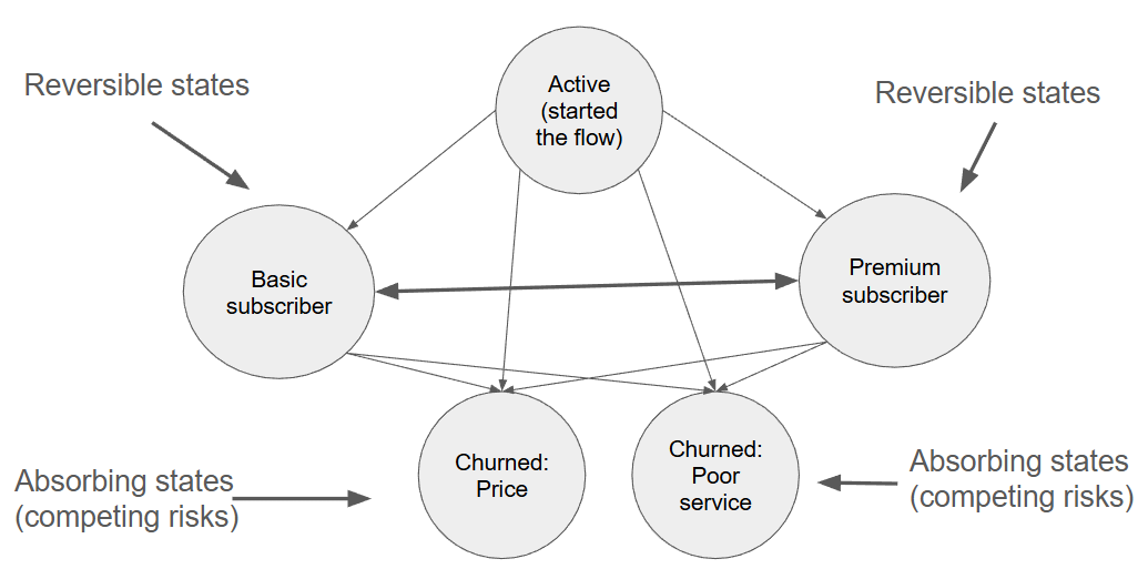
If these assumptions are violated, Survival Analysis offers other sophisticated tools. While Kaplan-Meier is a two-state model,
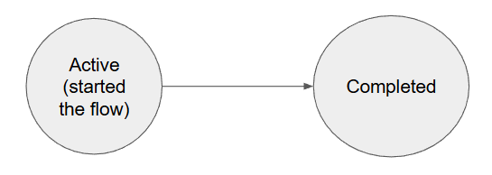
we can employ Multistate models to track users across numerous reversible and absorbing states (competing risks). For instance, modeling transitions from an "Active" state to "Basic Subscriber," "Premium Subscriber," "Churned: Price," or "Churned: Poor service" and movements between those states. It is also possible to include other covariates in this model to check if they boost state transitions in any direction (e.g. marketing campaigns).
These advanced scenarios can be estimated using:
- Semiparametric Models (e.g., Cox proportional hazards regression).
- Parametric Models (e.g., Accelerated Failure Time Model).
- Machine Learning Models (e.g., Survival Trees or Random Forest).
Summary: Stop Measuring Time Wrong
If you were to remember only two things away from this, remember to always ask these two questions (to others but most importantly to yourself) when seeing a time-to-event metric:
- Equal Time: If we are comparing groups/cohorts, have they been measured for the same length of time?
- Survivors: Did we include 100% of subjects that started the process, or are there any subjects that haven’t completed the process at the time of the measurement (i.e., censored data)?
Moving from simple, biased averages to the structured approach of Survival Analysis ensures that your time-based metrics are comprehensive, accurate, and truly reflect the speed and success of your user journeys.
About me: Quant, Data Scientist, Researcher, Econo-Physicist, Psychologist.
I transform data into insights by combining coding, a Physicist’s mathematical modeling expertise and rigor, UX experience and a Psychologist’s understanding of humans to improve products, build data-driven organizations & delight users.
Follow me on LinkedIn: https://www.linkedin.com/in/michal-chorowski/.
If you are interested in my academic work - check out my Google Scholar.