How Autumn (Foliage) Is Measured
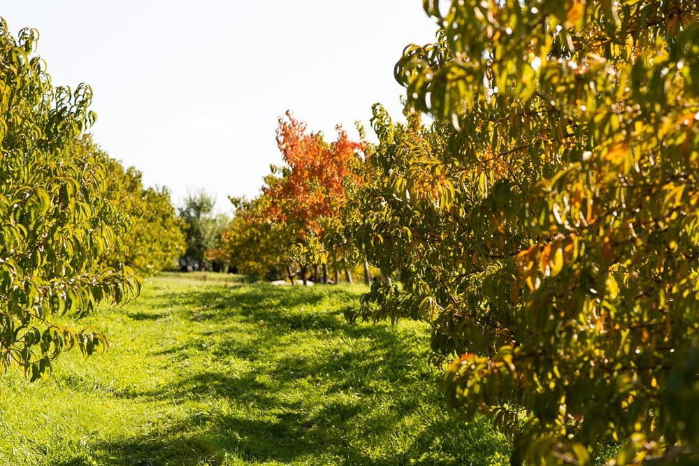
It's the beginning of autumn here in the NY area and so the trees have been starting to change their color. Upstate NY and New England often use the foliage as a tourist attraction so every so often you see reports of whether the foliage is at "peak" or not along with the weather reports. There's regional dashboards that show the foliage status for large areas of the country. So there must be data collection going on here – let's dig into that this week!
The basic methodologies
When it comes to figuring out whether the trees in an area have begun to turn color, there's three broad ways that it can be done.
- Direct observation – The obvious way is for people, folks who maintain and monitor forests, citizen scientists, etc., to keep records of what they're actually seeing on site and sending those records to some centralized place.
- Remote sensing – Cameras and scientific sensors that can collect data remotely – this includes satellites.
- Predictive models – given that trees change their foliage in response to a combination of the amount of sunlight they get as well as local weather conditions over time, they can be modeled and predicted.
Direct observation methods
We're all data nerds here, so we know that data collection and observations hinge almost entirely upon definitions. The definitions have a profound effect on what data gets collected and all the downstream analysis that happens. And so, the definitions surrounding autumn foliage can vary.
First, the National Phenology Network, which seems to be the big network of scientists, volunteer observers, and other people who make observations of the regular seasonal changes of nature. They published their definitions of the various live stages of nature. The definition book covers a ton more than just leaves, but here are the two relevant sections for us today:
Colored leaves (Tree/Shrub): One or more leaves show some of their typical late-season color, or yellow or brown due to drought or other stresses. Do not include small spots of color due to minor leaf damage, or dieback on branches that have broken. Do not include fully dried or dead leaves that remain on the plant.
What percentage of the potential canopy space is full with non-green leaf color? Ignore dead branches in your estimate of potential canopy space. Less than 5%; 5-24%; 25-49%; 50-74%; 75-94%; 95% or more
Falling leaves (Tree/Shrub): One or more leaves with typical late-season color, or yellow or brown due to other stresses, are falling or have recently fallen from the plant. Do not include fully dried or dead leaves that remain on the plant for many days before falling.
So for colored leaves, there's 6 buckets of the estimate percent of canopy that is showing some of their typical late season color. Volunteers who are observing trees that exhibit autumn foliage would make their observation and submit it to the network. People like ourselves can also go download the data to play with or do research if we want.
Somewhat more confusingly, local governments may run their own foliage reporting because for whatever reason, especially for tourism. One such case is NY doing their own foliage report.
For the report that came out Sept 30, for NYC it said:
In Manhattan:
20% change on the Lower East Side of Manhattan with some yellow leaves appearing.
10% change on the Upper East Side in Central Park with mostly green leaves.
In Queens:
5% change in Queens in Jackson Heights with touches of red and yellow
For Franklin County:
85% change with near-peak and peak conditions in Tupper Lake and Mt. Arab with a vibrant kaleidoscope of dandelion, goldenrod, maple syrup, russet, marmalade, pumpkin, crimson and rhubarb hues.
The percentages are more fine grained, it mentions colors like yellow, green, red, purple. They even have a frustratingly vague line that reads "I LOVE NY defines "peak" as the best overall appearance the foliage will have during the season, taking into account color transition, brilliance, and leaf droppage." I have no idea what that means in terms of taking an objective measurement, but since this is all vibes for tourism marketing, they're fine with it.
Remote camera data
So while human reports are easy to scale and, with proper protocols, be very robust, having a literal camera do the data collection can help with certain details.
In comes things like the PhenoCam network, which have cameras that take regular pictures of a specific location throughout the entire year. For example, here's a camera near the Hudson river. The tree species in view are listed in the camera description so anyone can make observations about autumn foliage by essentially doing color analysis on the pixels. You'd have to define cutoffs and metrics of course, but it's something.
One thing to note about much of this research is that scientists don't really publish articles specifically targeting "pretty autumn colors". A lot of the research I could find is usually tied to understanding how to measure photosynthesis and when plants have started or ended their growing season or not. There's various metrics that I've seen, but the most easy to understand for me is something called Green Color Coordinate (GCC) and Red Color Coordinate (RCC). GCC is simple, take the (R)ed, (G)reen, (B)lue colors in a standard computer image, put them into a formula: Gcc = G / (R+G+B) and Rcc = R / (R+G+B). This formula essentially normalizes the strength of the individual color channel by the overall brightness of the image. Overall, as forests turn green, GCC will climb up, and as the green fades away to other colors, GCC fades down while RCC goes up. Given how the two metrics behave, our notion of "autumn foliage" is some interaction between the GCC/RCC values.
In addition to dealing with RCC and GCC, scientists still have to process the image to account for changes in weather (fog and rain can shift colors), white balance of the camera (which can shift as sunlight color changes over the course of the day), and masking out things they don't want in the image, like open sky, buildings, etc.
Scientists who make use of the PhenoCam network I mentioned earlier take the camera data and make plots of GCC and RCC values over time. For example, this paper noted that GCC and RCC were both useful in understanding photosynthesis behavior in broadleaf forests, but RCC seems more useful for evergreen forests.
Satellite data
Well, if a bunch of webcams pointed at trees can provide a bunch of data, what about the big satellites that are pointed at the Earth? There's lots of data from MODIS, Sentinel and Landsat datasets, and researchers have definitely used them to explore what vegetation on the planet is doing.
So the metric I came across the most in my reading about satellites observing vegetation is "Normalized Difference Vegetation Index" (NDVI). It is calculated using spectral measurements from two bands, Near Infrared (NIR) and Red. The formula is pretty simple and is as follows:
NDVI = (NIR - Red) / (NIR + Red)
NIR and Red take values between 0 and 1, so the NDVI ratio goes between -1 and +1. The metric is this way because healthy green plants will strongly absorb Red light with their chlorophyll, while healthy plants tend to reflect near infrared light. But as autumn approaches and chlorophyll breaks down and plants begin to die, the ratio shifts.
At least, that's how it works in theory. But there's always operational details that can muck things up. For example, clouds and other atmospheric conditions can mess with satellite observations, so data has to be collected over time. Also, when tree leaves fall, they can reveal the ground underneath and that might actually have vegetation that is green (like grass or moss) which can affect the observed values. Finally, satellites have limited resolution, so one pixel of a satellite image can cover anywhere from a few square meters to many hundreds of square meters. All the trees and vegetation data will be averaged together.
A lot of work went into validating whether NDVI is a useful measure of the state of vegetation, and in fact PhenoCam data and RCC/GCC values popped up in various studies I skimmed over. All methods have their plusses and minuses, so this is just another tool in the scientific arsenal that researchers use.
Either way, NDVI is essentially a measure of green-ness, so again, to figure out if "autumn is happening" for a region, you would have to track the value over time and watch it trend down in the correct time period and draw a cutoff line. NDVI relies on chlorophyll so when that gives way to the reds and yellows of autumn (caused by Carotenoids and Anthocyanins), you need a different metric. It's messy because the number can change for all sorts of reasons like wildfire. But it's a way to get started. There's things like the Anthocyanin Reflectance Index (ARI) and Red-Green Vegetation Index (RGVI) to help supplement NDVI data for looking for autumn.
There's a surprising amount of satellite data available for random poking with, thanks to NASA and similar governmental agencies. So for example you can find NDVI maps here, among many other places.
Finally, math
OK, so it's natural for us to think that "hey, given timing and sunlight and weather, surely there must be a model for autumn foliage." And well, scientists thought the exact same thing years ago. Despite that, it seems that given the wide variation of tree species, geographies, and local conditions for forests around the world, there's no single model that seems to be the gold standard that everyone uses. So I'll just look at one model that seems the most relevant for my area (New England, yeah NY is technically not NE but we're right next door.)
In this paper from 2013, researchers used data from the Harvard Forest which had detailed records of leaf coloration from 1993 to 2010 made every 3-7 days by the same observer. It is apparently one of the longest continuous data sets on this topic available.
The researchers of course did a correlation analysis and ran a regression model to try to fit the data. But they also adapted a "cold-degree-day photoperiod-dependent model" (from Delpierre et al., 2009). In that CDD/P model, the intuition is that when the days hit a certain critical length as the autumn days shorten, they start accumulating cold-degree-days. A cold-degree-day is like the inverse of a spring growing day, in that it's hours below a certain temperature. The idea is that once trees accumulate enough cold days, that triggers the change in leaf color and eventual leaf dropping. There's biological reasons for why the model has those mechanisms in, essentially enzyme activations and such, but I'm no biologist.
What the researchers did with their model is essentially run a giant parameter search of the CDD/P model to find the parameters for the critical day length, the temperature below which "cold hours" counts, and the total number of cold hours needed to trigger leaf changes so that 50% of the canopy has color. This had to be done for each species of tree individually since they behave differently. Once all the parameters were fit, the researchers concluded that their CDD/P model accounts for much of the variation that trees in the area showed with respect to their timing of foliage color change. Their model also did better than a simple regression.
There's no one clear way
As you can see with all the different methods listed, there's no single magical definition of autumn foliage measurement. It stands to reason given that different species respond to local conditions differently and so can change color at different times. It's an inherently continuous variable that requires researchers to pick fairly arbitrary thresholds.
On top of that, it's really tricky to get good measurements. Either humans have to record data via direct observations of a small area, or we have to deploy vast networks of cameras and satellites that miss out on various finer details because most of the metrics involved measure the greenness of a space and not the various reds, yellows, and browns that we associate with autumn. All the data being collected, whether by humans on individual trees, a group of trees via camera, or a giant chunk of land via satellite, are all useful in different ways, and very hard to reconcile with each other. At best they all point in the same direction in the aggregate, but it's hard translate from one to the other. So, like everything, it's still an open area of research.
Or you could be like a tourism board and just make up your own system to optimize for prettiness.
Standing offer: If you created something and would like me to review or share it w/ the data community — just email me by replying to the newsletter emails.
Guest posts: If you’re interested in writing something, a data-related post to either show off work, share an experience, or want help coming up with a topic, please contact me. You don’t need any special credentials or credibility to do so.
"Data People Writing Stuff" webring: Welcomes anyone with a personal site/blog/newsletter/book/etc that is relevant to the data community.
Counting Stuff Official Forums: Discuss posts, or other data topics with the community.
About this newsletter
I’m Randy Au, Quantitative UX researcher, former data analyst, and general-purpose data and tech nerd. Counting Stuff is a weekly newsletter about the less-than-sexy aspects of data science, UX research and tech. With some excursions into other fun topics.
All photos/drawings used are taken/created by Randy unless otherwise credited.
Supporting the newsletter
All Tuesday posts to Counting Stuff are always free. The newsletter is self hosted. Support from subscribers is what makes everything possible. If you love the content, consider doing any of the following ways to support the newsletter:
- Consider a paid subscription – the self-hosted server/email infra is 100% funded via subscriptions, get access to the subscriber's area in the top nav of the site too
- Send a one time tip (feel free to change the amount)
- Join the Approaching Significance Discord — where data folk hang out and can talk a bit about data, and a bit about everything else. Randy moderates the discord. We keep a chill vibe.
- Get merch! If shirts and stickers are more your style — There’s a survivorship bias shirt!