Paper read: kids bringing germs home (sorta)
Summer is half over?!?!
On social media this week. I came across a cute, very short paper that dose the thing we humans love – confirming a preconceived notion I had. Specifically, this paper is a year-long study of families in Salt Lake City, Utah, that tracks entire families and studies how often they have respiratory infections. For laypeople that aren't doing medical research, it's just a cute little bit of information. It's a light little aside from the more in-depth stuff we normally cover that I just found interesting this week.
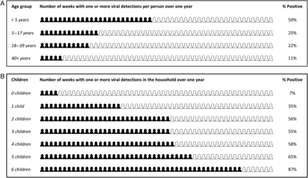
What the primary figure in the paper presents is the number weeks out of a year where a household had a respiratory virus, cut first by the age of the individual, as well as the total number of children in the household. The results confirm what many parents know – little kids are giant germ vectors. The number of weeks in the house that had a detected virus swab jumps up massively when there are children in the household.

The study itself is surprisingly simple in concept (though I imagine it was quite troublesome in practice). The researchers recruited 26 households (4 single individual households, 22 of size 3 to 8 people) and tracked them through a whole year, having them submit weekly PCR swabs of every individual as well as weekly journal entries about any respiratory symptoms. This data was collected in 2009-2010, and the paper was published in 2015. This was long before the rest of the world even understood how "PCR" and nasal swabs meant "distinctly unpleasant stick up the nose". The fact that they got 26 households to agree to go through with doing 52 of these over the course of a year, including any small kids, is pretty impressive. The methods report that out of the potential 5391 person-weeks of observations (both nasal swabs and diary entries) they got back 84% of them. They ultimately used 77% of the observation data, excluding entries/samples that were later than their protocol allowed.
The broad takeaway is that having kids in the household, especially very young kids under the age of five, massively increased the odds of having someone with an active viral infection in the home. That comes as no surprise to any parent who's ever sent a kid to daycare or school and they bring back the latest disease. What's also interesting to me is how the study notes that many viral infections are asymptomatic (44% of instances where viral infection was detected wasn't associated with symptoms in the correlating diary entry).
Younger kids were more likely to show symptoms during an infection than older adults too. That sorta jives with the surreal experience of our kid running around the house with a runny noise or light fever and while the adults are mostly fine. It's not that we didn't get an infection (which always seemed unlikely given family living conditions) but symptoms were just less likely to present for us compared to the kid.
But as I look more carefully at the charts and tables, I find a need to be careful with interpreting that primary figure. The authors clearly stated in the figure itself that these are the average number of weeks out of the year that an infection was detected based on their data. What our brains want to do is interpret the chart (especially the lower one) as a probability of having an infection over the course of the year, given the number of children we have. But the lower chart was formulated at the household level and just approximates the odds of having active infection in the house which may or may not even present symptoms. Given how it takes time for a germ to spread among family members and clear out (the average illness seemed to take about 2 weeks), you'd expect a large household faced with a single disease to take more weeks to complete clear it in a vacuum as it takes time to incubate and spread. I wouldn't be too surprised if someone ran this study on a school classroom of ~25 kids and found that the number of weeks where at least 1 kid in the classroom had some viral respiratory infection was close to 100% of the time.
All this is probably useful information for medical research purposes, the discussion section mentions how different viruses had a different percent association with symptoms – influenza A showed symptoms >75% of the time, while rhinovirus only showed about half the time. But that same information is not helpful to a layperson wanting to understand just how many novel diseases the little one is bringing home and how long the family will be miserable.
Ah well. At least we know for most of these respiratory diseases, they usually clear up in 1-2 weeks.
Standing offer: If you created something and would like me to review or share it w/ the data community — just email me by replying to the newsletter emails.
Guest posts: If you’re interested in writing something a data-related post to either show off work, share an experience, or need help coming up with a topic, please contact me. You don’t need any special credentials or credibility to do so.
About this newsletter
I’m Randy Au, Quantitative UX researcher, former data analyst, and general-purpose data and tech nerd. Counting Stuff is a weekly newsletter about the less-than-sexy aspects of data science, UX research and tech. With some excursions into other fun topics.
All photos/drawings used are taken/created by Randy unless otherwise credited.
- randyau.com — Curated archive of evergreen posts. Under re-construction thanks to *waves at everything
Supporting the newsletter
All Tuesday posts to Counting Stuff are always free. The newsletter is self hosted, so support from subscribers is what makes everything possible. If you love the content, consider doing any of the following ways to support the newsletter:
- Consider a paid subscription – the self-hosted server/email infra is 100% funded via subscriptions
- Share posts you like with other people!
- Join the Approaching Significance Discord — where data folk hang out and can talk a bit about data, and a bit about everything else. Randy moderates the discord. We keep a chill vibe.
- Get merch! If shirts and stickers are more your style — There’s a survivorship bias shirt!