Earthquakes bringing in tons of survey data
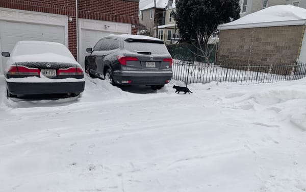
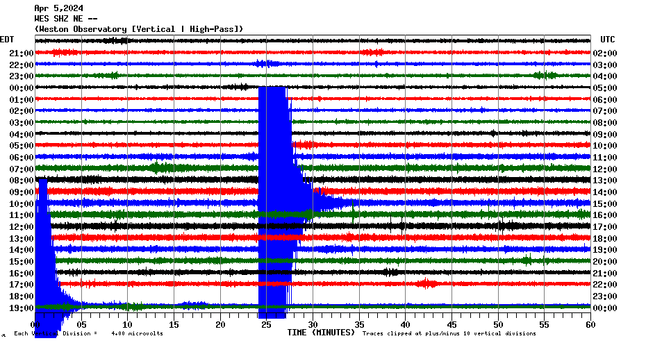
April 5th had a surprise in store for me while I was busy making last minute checklist plans for our long drive north to view the total eclipse – I got to experience the second noticeable earthquake of my life here in NYC. This earthquake was rated as a magnitude 4.8 and was very noticeable while I was working at home. The previous earthquake I've experienced was the magnitude 5.8 earthquake in 2011 in Virginia.
Apparently, the way the bedrock and geology work in the northeast allows seismic waves to travel much further than it does on the west coast. The seismograph in Boston in the main header image of this post very easily picked up the earthquake, and there were many reports of people feeling it all the way there.
What's interesting was how the USGS came to understand this property of the northeast. After all, the Northeast US is not a very geologically active location so there aren't a lot of sensitive seismometers scattered around to provide high resolution data. One of the primary contributing data sources was their "Did you feel it?" (DYFI) tool – a (open source!) system that allows people to take a survey and report whether they did (or didn't) feel an earthquake. This data is then actually used to generate near-real-time maps of what shaking intensity was experienced by people.
Now, as data scientists, or just normal scientists, I'm sure that the first initial reaction would be to ask whether this collected data would have any scientific value at all, but research done by the USGS has found that for mild/moderate levels of shaking there's a surprising amount of agreement with other more precise and objective measurements.
And so, I grew curious about how that data is collected and used. I was especially interested in the questionnaire that was used to collect the data. When I took the survey myself, I was amused how it asked me for my description of the shaking even though I only had experienced two earthquakes in my life (I put in "mild").
Little did I know it would send me on bit of a chase through papers and the history of earthquake data collection.
Quick backgrond knowledge
Before we dive into things, let's get some background stuff down. There are multiple ways of reporting the strength of an earthquake. Laypeople tend to be familiar with "magnitude" scales, which report a measure of the amount of force or energy an earthquake releases. The problem with magnitude is that depending on the specifics of the earthquake, including the exact location and depth and how the earth is moving, the same magnitude can have differing effects.
So another way earthquake strength can be reported is based on "intensity" scales like the Modified Mercalli intensity scale. These scales use empirical observations to classify. For example, a VI "Strong" intensity earthquake is characterized as "Felt by all, and many are frightened. Some heavy furniture is moved; a few instances of fallen plaster occur. Damage is slight." While a intensity IV "Light" earthquake might have among other things "Dishes, windows, and doors are disturbed; walls make cracking sounds."
The goal of DYFI is to get a sense of intensity, not magnitude. So already, surveying a bunch of random self-selecting non-expert people from the internet is a bit less of a problem than it initially seems. On average it doesn't take expert training to identify whether objects were shifting or falling over.
Just how useful is the collected DYFI data?
Surprisingly, thanks to the careful research over time, the data collected correlates well with other measurement methods like seismometers. USGS overlays the DYFI data against their "ShakeMap" product, and both tend to agree. The difference is that DYFI collects data from ordinary people while the ShakeMap data is based off seismographs.
What's also great about DYFI is that it is very timely. It's definitely faster than having experts on the ground identify damage and send in reports. The system has a large automation component, so it's even faster than having a scientist review reports to make some kind of official classification.
DYFI data isn't perfect though. For example, extremely strong and devastating earthquakes tend to be problematic. Once buildings start breaking, it becomes hard to for ordinary people to distinguish between the different intensity levels. There's also issues with bias of the people self selecting to send in reports – they tend to be affluent enough to have internet access and know to go to the site to contribute.
The DYFI questionnaire
These are the questions of the DYFI system. Each are multiple choice (with optional free response) that I omitted for space.
- What was your situation during the earthquake?
- If you were inside a building, what floor were you on?
- If you were inside a building, how tall was it?
- Were you asleep?
- Did others nearby feel it?
- How would you describe the shaking?
- How did you react?
- How did you respond?
- Was it difficult to stand and/or walk?
- Did you notice any swinging of doors or other free-hanging objects?
- Did you hear creaking or other noises?
- Did objects rattle, topple over, or fall off shelves?
- Did pictures on walls move or get knocked askew?
- Did any furniture or appliances slide, topple over, or become displaced?
- Was a heavy appliance (refrigerator or range) affected?
- Were free-standing walls or fences damaged?
- Was there any damage to the building?
- Additional comments
How's the survey data used to calculate intensity?
While reading about the survey itself, I found it interesting that it calculates intensity in fairly complex way. The published algorithm takes 8 of the questions, pools the responses from a given geographic area (zip code, map grid, etc.), converts the average response into points, which are then weighted and summed into a score. The score is then plugged into a formula (derived from regression against older expert-derived intensities).

Where did this questionnaire come from?
So naturally, I was curious just where this questionnaire came from. While it had been used for DYFI for the past 20+ years, it seemed to trace its roots further back.
Searching around led me to this paper "An intensity survey of households affected by the Northridge, California, earthquake of 17 January 1994" that described how researchers used phone surveys to get a sense of how far the shaking spread for the 1994 Northridge earthquake. Apparently using phone surveys was an innovation at the time? (I'm not sure it was the absolute first time, but definitely early enough to warrant publishing a paper on.)
More importantly, the methodology prior to phone surveys was snail mail. Surveys were sent via mail to post offices in affected regions, including areas affected by the Northridge quake. Responses to those paper surveys, and evaluations by experts, were what was used to identify how far a given earthquake could be felt. Compiling the data could take weeks. I'm not sure how long postal surveys had been sent out for earthquake research, but my impression is that it was a very long staple methodology.

The questionnaire has a very long history and strongly resembles measures made over the years by various other instruments. They all effectively ask about whether people felt it, whether things moved on shelves, hung pictures moving, furniture moving, and varying levels of damage to buildings. There's also apparently enough overlap in methodologies so that newer methods can be compared against older ones. The formula used to convert the DYFI scores derived from responses into intensity values came from using linear regression to correlate the scores against known intensity values from other instruments for the same earthquake.
So yeah, asking people works
One thing the researchers who developed and work with the DYFI data agree with is that while the individual responses of untrained random anonymous people on the internet have limited value as a data point, having a large quantity of such data points proves to be surprisingly informative. The averaged responses tended to generate intensity values that were within a single standard deviation of values derived from more reliable expert evaluations.
I know that there's people out there who are always a bit skeptical about survey methodologies because they always see the inherent subjective hurdles that simply can't be removed from any survey. But DYFI is a good example of how a carefully crafted survey is sometimes the only cost effective way of collecting critical data.
Standing offer: If you created something and would like me to review or share it w/ the data community — just email me by replying to the newsletter emails.
Guest posts: If you’re interested in writing something a data-related post to either show off work, share an experience, or need help coming up with a topic, please contact me. You don’t need any special credentials or credibility to do so.
About this newsletter
I’m Randy Au, Quantitative UX researcher, former data analyst, and general-purpose data and tech nerd. Counting Stuff is a weekly newsletter about the less-than-sexy aspects of data science, UX research and tech. With some excursions into other fun topics.
All photos/drawings used are taken/created by Randy unless otherwise credited.
- randyau.com — Curated archive of evergreen posts. Under re-construction thanks to *waves at everything
Supporting the newsletter
All Tuesday posts to Counting Stuff are always free. The newsletter is self hosted, so support from subscribers is what makes everything possible. If you love the content, consider doing any of the following ways to support the newsletter:
- Consider a paid subscription – the self-hosted server/email infra is 100% funded via subscriptions
- Share posts you like with other people!
- Join the Approaching Significance Discord — where data folk hang out and can talk a bit about data, and a bit about everything else. Randy moderates the discord. We keep a chill vibe.
- Get merch! If shirts and stickers are more your style — There’s a survivorship bias shirt!